7 Great Examples of Ecommerce Referral Programs in 2024
Intro
“Oh, I like that! Where’d you get it?” – we ask this all the time. Even before the internet, retailers relied upon the goodwill and kind words of customers to impact the bottom line.
These days, over 92% of consumers trust a recommendation about a sale from their inner circle. Leading e-commerce brands understand that referral marketing can drive a significant portion of their revenue and build existing customer loyalty. As our ecommerce marketing strategies advance and the customer journey demands rewarding brand experiences, companies are using multichannel tactics to drive engagement and welcome new users via word of mouth.
In this post, we will delve into the various methods used by ecommerce retailers to reach their most loyal customers and convert them into advocates for their brand. By leveraging the power of email marketing, landing pages, and website design, these retailers are able to connect with their customers in a meaningful way that drives stunning profits. As reported by the Harvard Business Review, customers who are referred to a business have been found to have a 16% higher lifetime value than those who were not referred. This is a powerful incentive for ecommerce retailers to focus on building strong relationships with their current customers and encouraging them to refer their friends and family to the brand. Through the strategic use of marketing campaigns, personalized incentives, and exceptional customer service, ecommerce retailers can foster a community of brand advocates who will continue to drive profits for years to come.
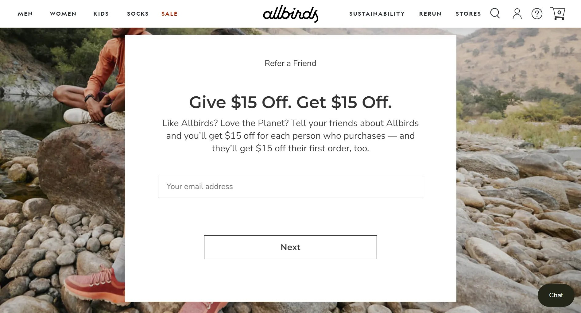
#1 Allbirds – Referral Landing Page
Allbird’s referral landing page is an excellent example of how simplicity and brand positioning can be used to create an effective referral program. The page features a background image of people on a hike wearing the brand’s sustainable shoes, emphasizing the product’s utility and eco-friendliness. The color scheme is on-brand and uses a lot of white space to structure the content hierarchy, making it easy to read.
The referral program itself is simple: both the referrer and the referee get a $15 discount if the referral is successful. By focusing on the brand’s core values and highlighting the benefits of the referral program, this landing page is an excellent example of how to drive ecommerce referrals.
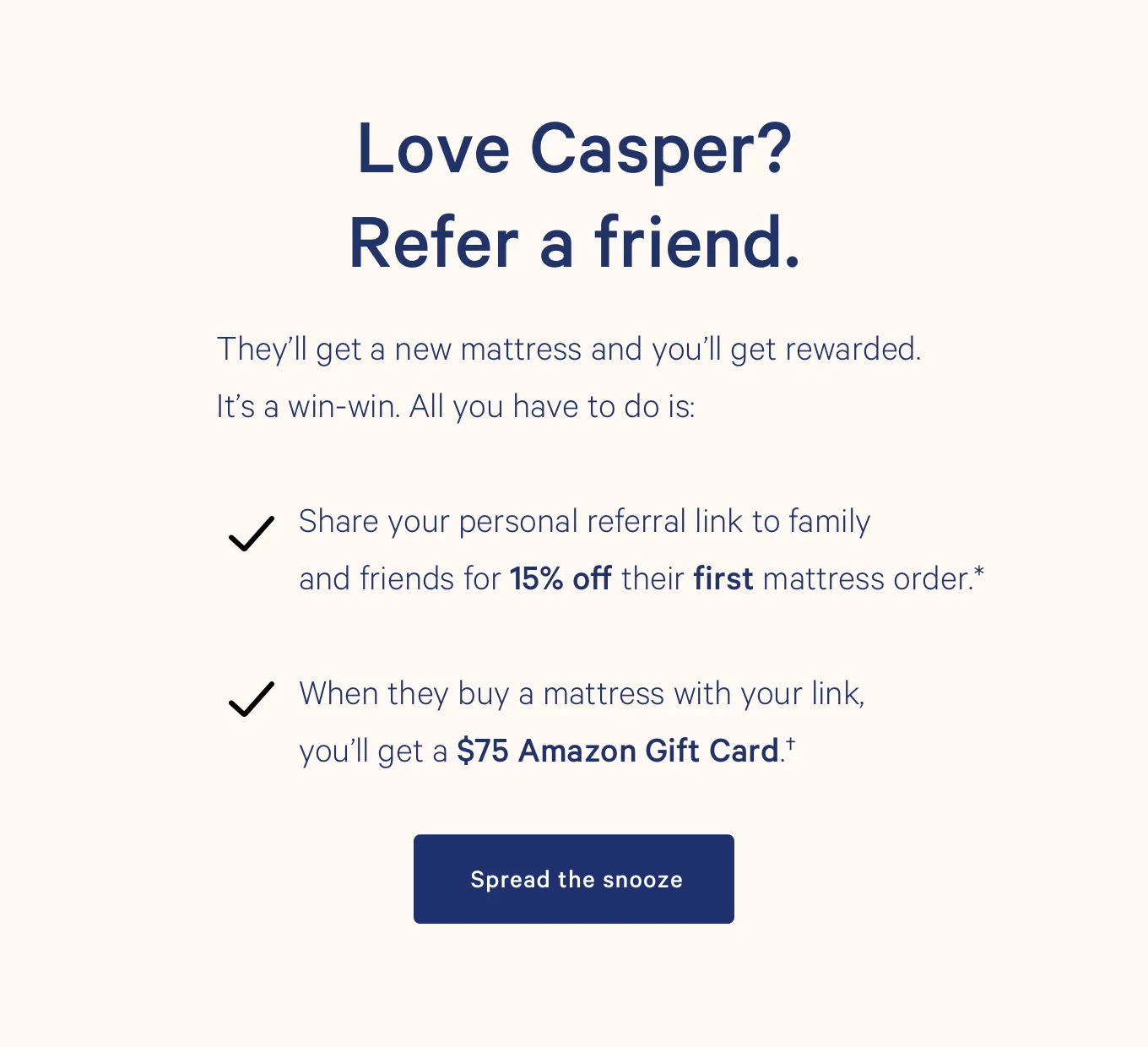
#2 Casper – Referral Email
Casper’s referral email is a great example of using simplicity to increase engagement. The email’s design is clean and minimalistic, with ample white space that draws attention to the main message. The call-to-action (CTA) is prominent, easy to locate, and includes a touch of humor. The email’s copy is concise, action-oriented, and clearly explains the benefits of entering the referral program for both the referrer and the referee.
Once entered, the referee receives 15% off their new mattress purchase, and once the order is confirmed, the referrer receives a $75 Amazon gift card. This is a great example of how an ecommerce brand can utilize different types of incentives to make their double-sided referral program more enticing.
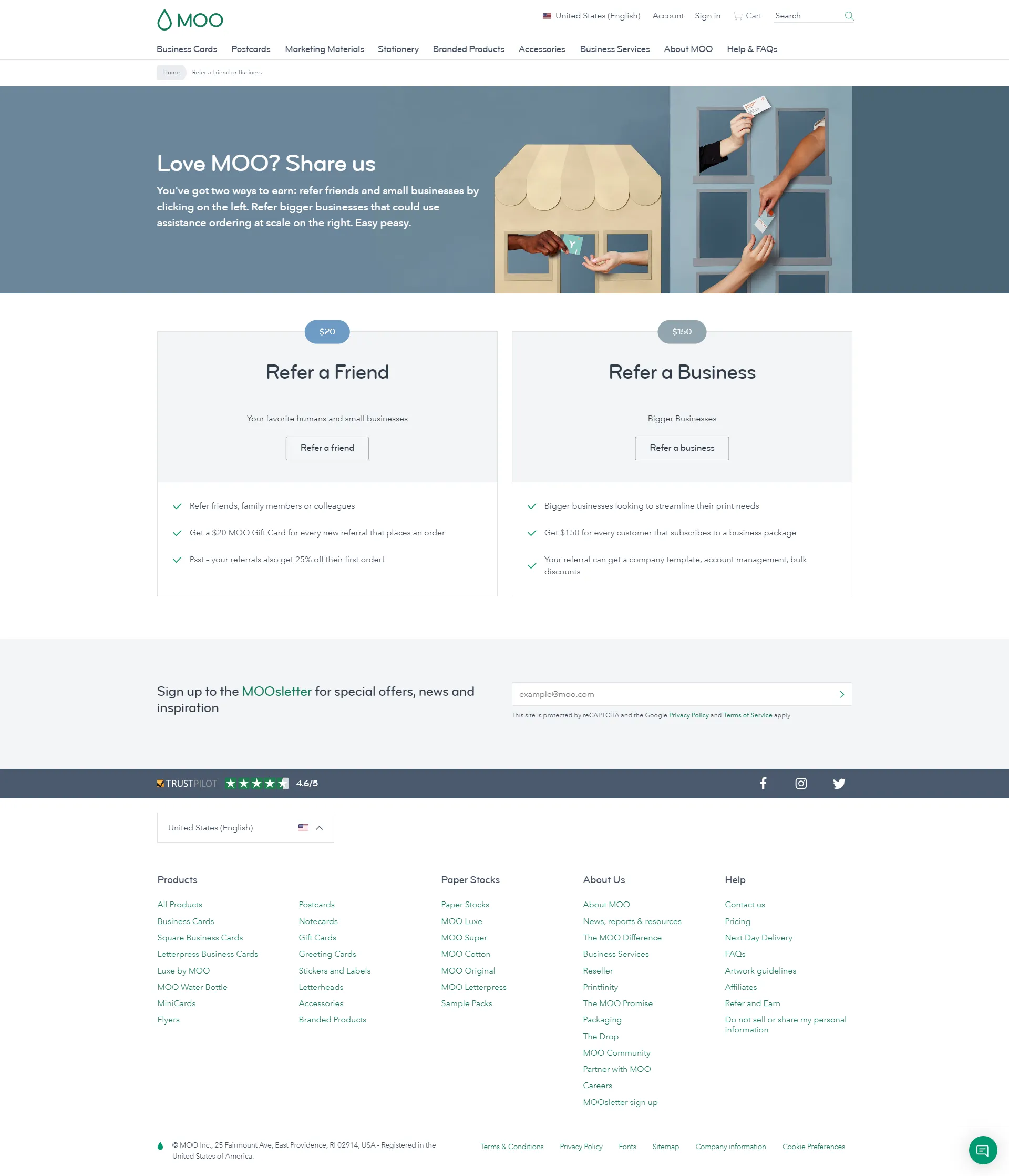
#3 Moo – Referral Landing Page
Moo’s referral landing page is a good example of a user-friendly interface that caters to the diverse needs of customers. The page highlights two different types of referral programs: one for friends and one for businesses. This makes it easy for users to navigate and find the referral program that is most relevant to them.
Both referral options, refer-a-friend and refer-a-business, clearly state the benefits of entering this double-sided program. For individuals who refer a friend, referees receive a $20 MOO gift card, while their referred friends receive 25% off their first order. On the other hand, for businesses who refer their contacts, the referrer gets $150 for every confirmed subscriber to the business package, and the referred business receives free product/service offers such as a company template, account management, and bulk discounts.
The landing page’s design is simple yet effective, with plenty of white space that emphasizes the benefits of participating in the referral program. The page’s simplicity also helps users to identify and understand the different referral programs available to them quickly.
Overall, Moo’s referral landing page is an excellent example of how to have a tiered referral program based on different referral participants, i.e., individuals vs. businesses. The page’s user-friendly design and clear communication of benefits make it easy for users to participate in the program and promote the brand to their contacts.
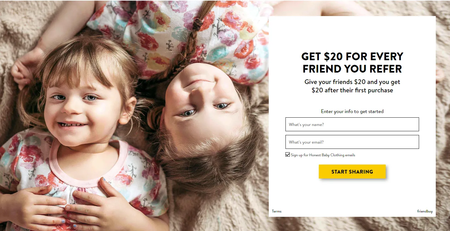
#4 The Honest Company – Referral Landing Page
The referral landing page from the Honest Company features a picture of two girls walking together, symbolizing friendship. The page clearly states the benefits of joining the referral program, which include getting $20 off for your next purchase and giving $20 off to your friend for their first purchase. The page has a lot of white space, giving it a clean and minimalist look. The CTA button is prominent, and by entering a name, you can ensure more personalized messaging. Overall, it’s a great landing page that effectively uses images, clear messaging, and white space to make participating in this referral program attractive.
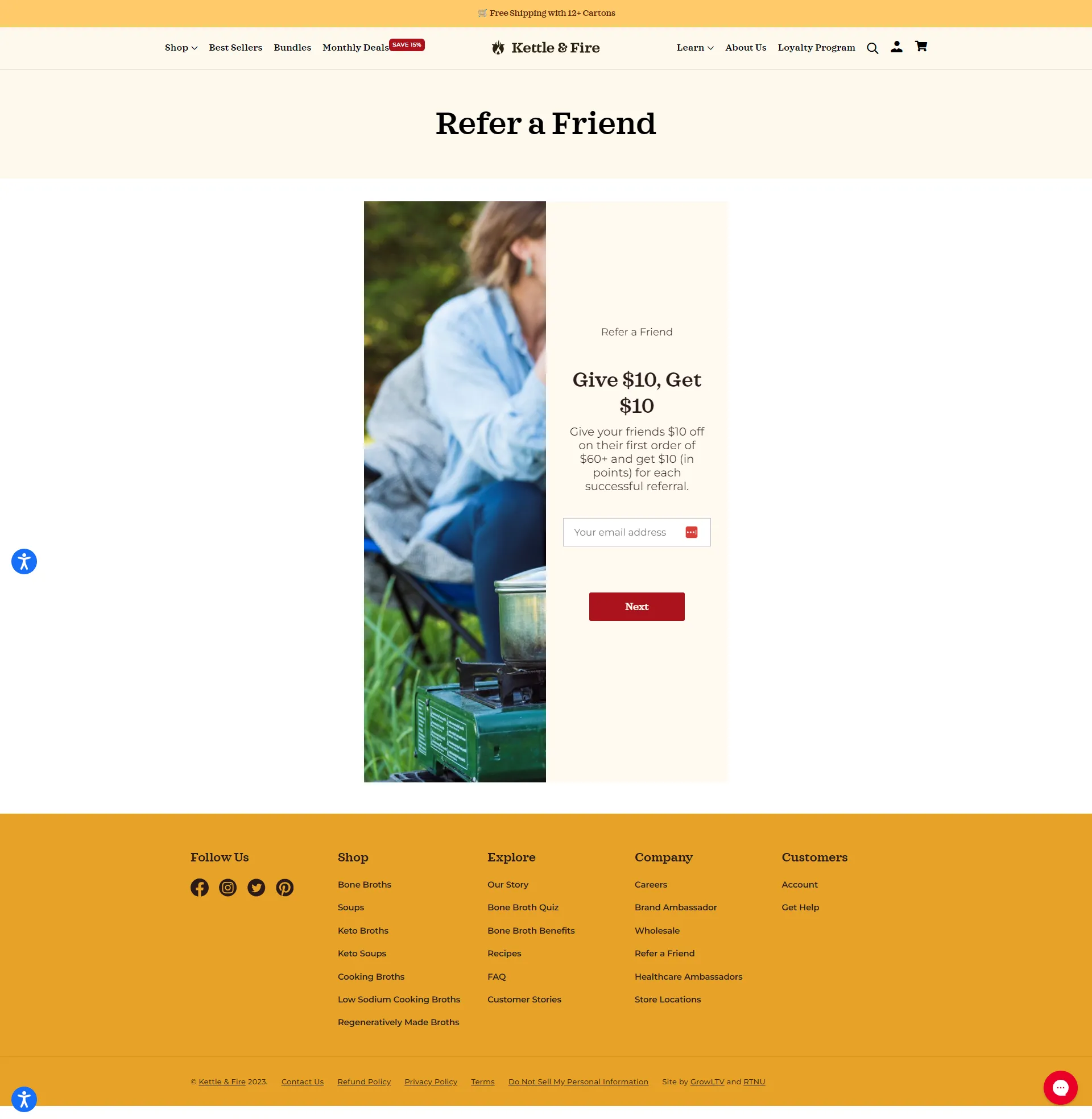
#5 Kettle & Fire – Referral Program
Kettle & Fire’s referral program is a standout example of how to provide equal benefits for both the referrer and the referee. The program offers an incentive of $10 off for both parties, which is prominently featured on the landing page. The page itself is clean and straightforward, with minimal text that emphasizes the benefits of the program. The call-to-action button is easy to find, making it simple for users to participate in the program and reap the rewards. Overall, Kettle & Fire’s referral program is a great model for effective referral marketing in the ecommerce industry.
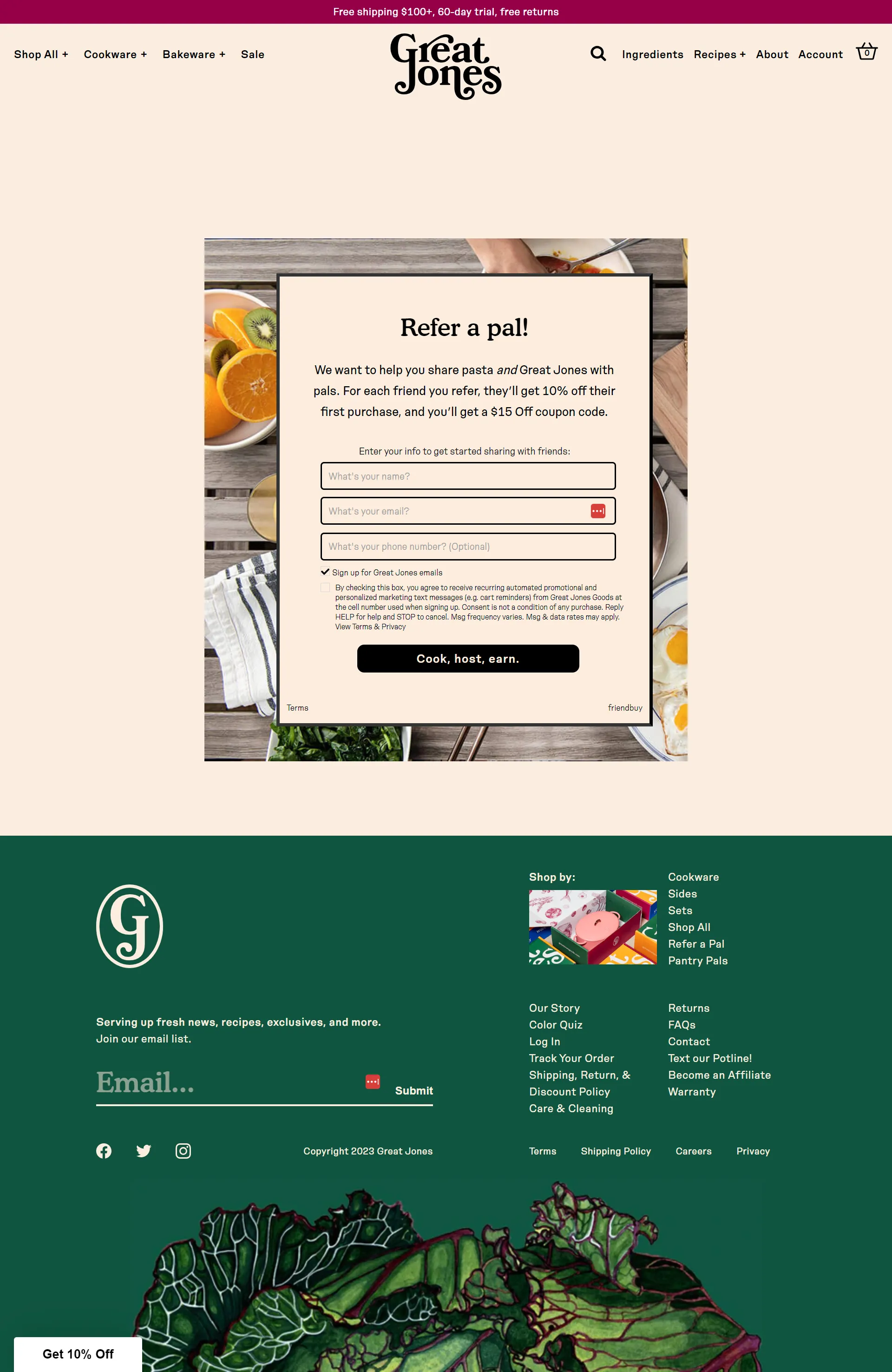
#6 – Great Jones – Referral Program
Great Jones’ referral landing page has an aesthetically pleasing design that highlights the purpose of their cookware with a food image background. The referral program offers a 10% discount for the referee and a $15 off coupon for the referrer. The use of personalization, such as using “pals” instead of “friends,” and unique CTA language, which states “cook, host, earn,” add a fun and engaging touch to the page. With its simple navigation and clear call to action, Great Jones’ referral program is a great example of effective referral marketing in the ecommerce industry.
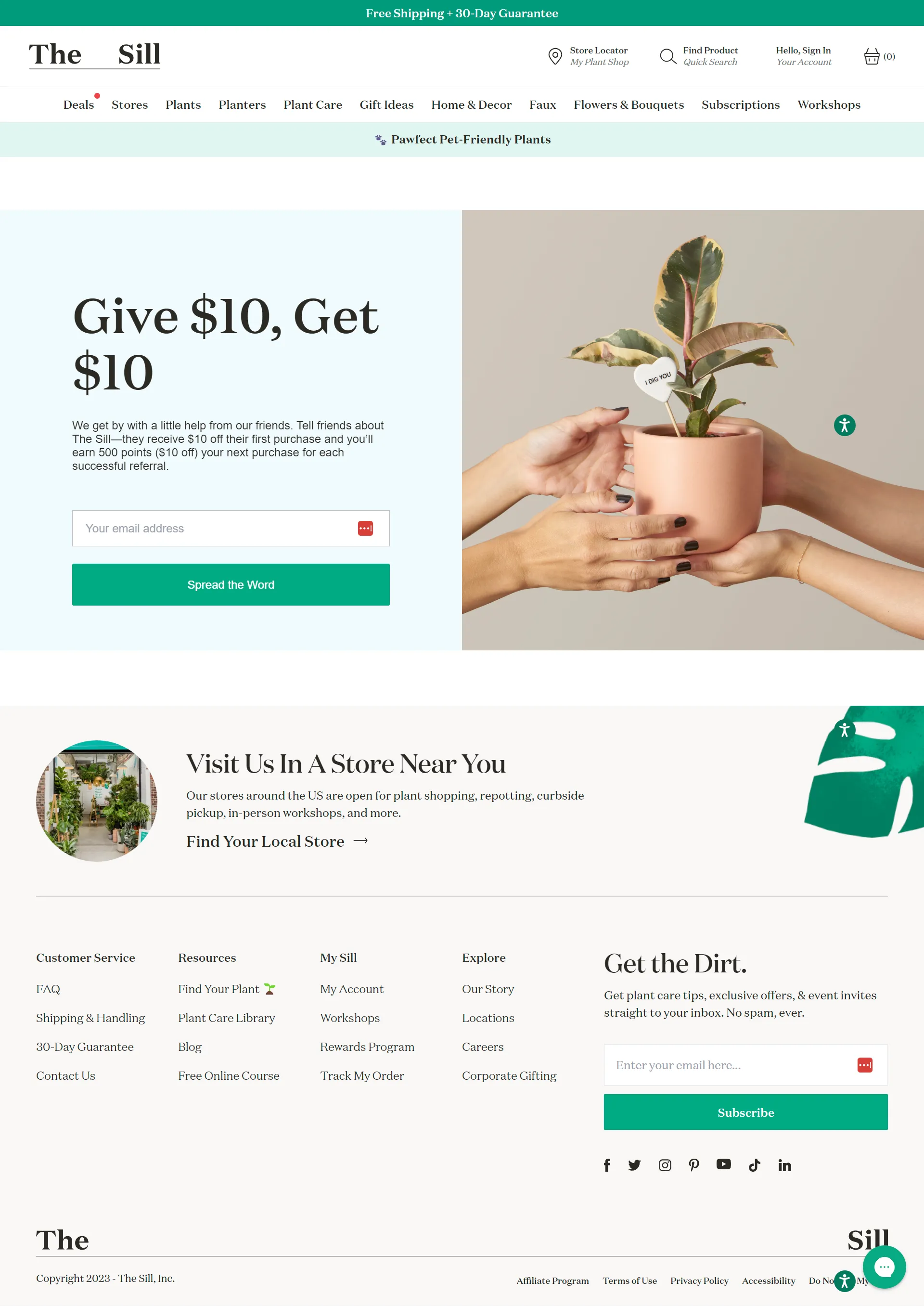
#7 – The Sill – Referral Landing Page
The referral lending page on The Sill’s website is well-designed, utilizing effective color and font hierarchy to create a clear and visually appealing layout. The referral program message itself employs a simple, clean, and minimalistic design, with a prominent call-to-action. The addition of an image and touch of humor is also a nice feature, enhancing the overall layout of the referral landing page. The program’s equal benefit is clearly explained – both the referrer and the referred friend receive $10 off their next purchase.
Wrapping Up
These have been seven examples of referral marketing programs from ecommerce retailers. All of these brands consistently appeal to their users’ preference for double-sided rewards and easy conversion steps. The best brands make CTAs highly visible and clickable amidst straightforward design themes and appropriate colors to match. Your copywriting technique should always be concise, focusing on driving conversions through active verbs while simultaneously involving readers in the text. When viewers imagine themselves inside the referral message, conversions increase, so hero images highlighting the mutually beneficial rewards to come are also critical. Whether you’re reaching out across mobile, email, websites or landing pages, be sure to emulate these top-earning brands to see your own revenue increases.