Beginner’s Guide to Conversion Rate Optimization
The world of conversion rate optimization (CRO) is full of myths and misleading information. Marketers are so hungry for pearls of wisdom that fresh statistics soon take on a life of their own, circulated as truth whether validated or not. If you’re not careful, web page conversion rates can become the scary stuff of urban legends and not in the way you want.
Testing your own webpage variations is the solution.
This article will share certified CRO tweaks while also highlighting the common CRO pitfalls marketers should steer clear of. Because implementing and testing your own theories is a must, we’ll go over the essential testing methods that will provide the relevant insights your brand needs to increase conversions with visitors.
Don’t worry: no scary math here. Only useful insights and guidelines proven to make sure your website is the best it can be.
What is Conversion Rate Optimization?
Conversion rate optimization is all about increasing the actions visitors take on your website. It’s about finding why visitors aren’t converting and taking the necessary measure to fix the situation. This can mean increasing purchases, downloads of your app or whitepapers, or signing up for email newsletters.
This methodology hinges upon using analytics and user responses to improve website performance. This means systematic and varied testing of your viewer interactions, which we’ll cover in detail soon.
Why is Conversion Rate Optimization Important?
Your website is your online business suit. You want to show up for businesses prepared to “WOW!” everyone and inspire confidence from the get-go. Having a non-optimized website is showing up to a Goldman Sachs board meeting wearing a suit your bought from Wal-Mart. And a clip-on Disney tie.
Does it work?
Well, yes. It covers the bases. But is it going help you be taken seriously and drive action like a $3,000 Gucci or Brooks Brothers getup?
Not even.
Fortunately for us all, CRO is basically free. So it only takes a bit of effort to dress your website to impress. Here’s a short list of reasons to improve the fiber of your digital fabric and get serious about giving users a seamless experience they won’t overlook.
#1 You Get More from Your Ideal Customers
Converting is key. Beyond this, you want customers to feel like their loyalty is well-placed and that they’re comfortable recommending your offering to their associates, friends, and family.
#2 You Can Always Be Better
You may have a freshly-minted and amazing website that’s netting conversions. This is awesome but consumer behaviors change on the internet as fast as fashion trends. A pain-free user experience (UX) is essential, yet new technologies have a way of redefining what “easy” means for consumers. Keep up-to-date with user preferences to maintain high conversions.
#3 You Get More of Those Scarce User Attentions
Do you like spending time on an ugly or an unwieldy website? No one does and that’s because we know it doesn’t have to be like that. With less attention span than the average goldfish, modern viewers scan for what they want and leave in increasingly fickle fashion.
An ideal layout and linear UX increases time-on-page enough to share brand values, net a conversion, and see users off with a positive impression in tow.
#4 Everything Else is More Expensive
Issues inherent to your website experience can be covered over with expensive advertising dollars. Spending money to smooth over flaws on to your website is like taking Advil to relieve pain from a broken ankle. Fix the issues and keep the money for high ROI tactics.
Think about this: if you double your conversion rate, you’ve cut your cost-per-acquisition (CPA) in half.
#5 It’s Essentially Free
CRO works with what you already have, so you needn’t increase spending to see instant results. Just do a better job of converting visitors once they arrive on your site. This will increase the return for current investments and net a higher percentage of customers, saving money needed to acquire new customers.
Speaking of free, The Sims 3 ran a test to uncover a way to increase free game registrations. Here’s the original page:

(Source)
And below is the test version.

(Source)
The test version increased conversion of the free trial by 128%. You’ll notice that new page emphasizes the complementary nature of the offer with immediate copy and a bold CTA action button. “Free” is a power word and can be said be improve conversions in almost every relevant cases.
But not all copy is created equal and sometimes power words can be misused, as below:
(Source)
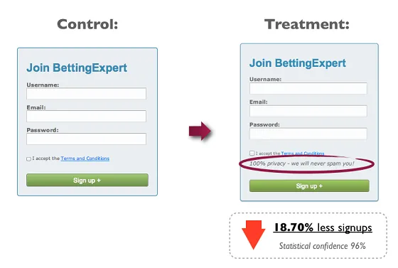
Guarantees, an oft-hailed silver bullet for website copy, can be boggled like this BettingExpert sign up box.
The company gets points for keeping the signup boxes to a minimum but the word “spam” sends almost a fifth of their readers running for the hills. Never speak of the devil lest he should appear, right?
(Source)
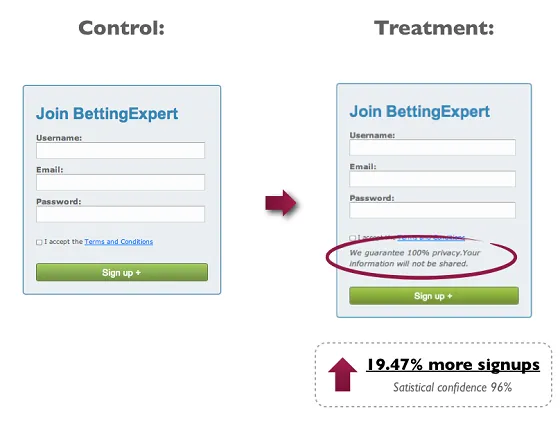
This improved version “guarantees” privacy in explicit language while avoiding use of the “S” word.
The Myths and the Truths of CRO
Eisenberg Holdings says that companies spend a typical $92 to bring customers to their page – but only $1 to convert them. For every $92 of ad revenue, $1 is being spent to evaluate these efforts and make sure you’re actually converting ad dollars into leads.
So let’s dive into the importance of testing CRO theories for best effect.
Many studies have been conducted about website optimizations by many companies with many different motivations. For example, a video marketing company is a likely candidate to show how homepage videos are a great idea.
Will homepage videos make sense for some brands? Yes. Is it for everyone? No.
While some truths seem to be self evident, others are flukes and case study-specific instances that don’t apply to every website. NPR reported on scientific studies are very often shown unreplicable and thereby untrustworthy. The testers desire to share information is so great and so the quality of testing suffers.
Variables for landing page optimizations have been tested and reported on by Kissmetrics and by Wishpond, seen below:
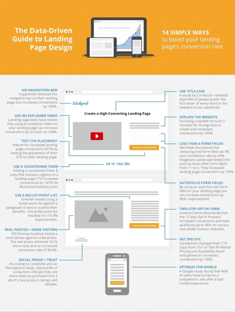
(Source)
- No more navigation bar
- Try an explainer video
- Test CTA placements
- Add pictures of people (humans are wired enjoy personalized pics of others)
- Use real pictures instead of stock photos
- Testimonials and social proof convert to brand trust and authority
- Use title case
- Cut down on form fields
- Reduce reading time with bullet lists instead of paragraph
- Autofocus form fields
- Simplify with two-step opt-in forms
- Get action-specific with CTA copy
- Optimize for mobile
These results seem solid and some are no doubt great improvements to your site. Try them out.
Consumer preference for title case lettering is valid, for example. And real photographs are definitely preferable to stock images. Using autofocus form fields is sure way to make user’s lives easier. These tweaks make your website experience more streamlined and credible while saving time.
Remember: acknowledge consumer psychology and the preference for improved UX when looking to make adjustments.
But how can we be sure these results will carry for you? After all, not all users and website are the same. And all test results are not certified. How to avoid blindly swapping one issue for another issue on someone’s recommendation?
Conduct your own testing.
Here’s the guide to all the testing you need to know about.
Before we dive into the details of A/B testing, multivariate testing, and single/two-tail testing, let’s look a few basic ideas:
- Buy your product or service as a customer would. Take screenshots throughout the conversion funnel and note sticky areas.
- Set up Google Analytics funnels. When used right, goals and funnels inside Google Analytics will show you where you’re losing traffic and big opportunities are being wasted.
- Survey your customers. Tools like SurveyMonkey gather email response surveys for users easily, or Kampyle can be used to take feedback directly from your site. Use heat mapping like Crazy Egg to show user scrolling and viewing patterns, record videos and more. Get information first, then start to analyze.
How to Use A/B Testing
A/B testing is comparing one version of a page or interface element against another version of the same thing. You create two different versions of a web page and split the traffic evenly between each page. Change any variable desired between pages, getting as radically different as you like.
A/B testing can turn into A/B/C/D/… testing very easily.
Start with a few tests to focus upon key elements to start with. Tests will take time to return a sufficiently large sample size to be credible, especially if your increase the number of test pages.
The token bad example is changing CTA buttons from red to green. Yes, each color has it’s own inherent values but this myth needs debunking. Viewers react to website (and most other) changes in a relative sense, but no more than someone changing the color of their shirt. A switch from one color to another will produce an stir but this effect will be short-lived. When users become used to the change all will return to normal, like in the case with “banner blindness.”
Symmetric Messaging
Symmetric messaging is creating ads that are consistent with your website or landing page to boost conversions. Test symmetric efforts with A/B methods.
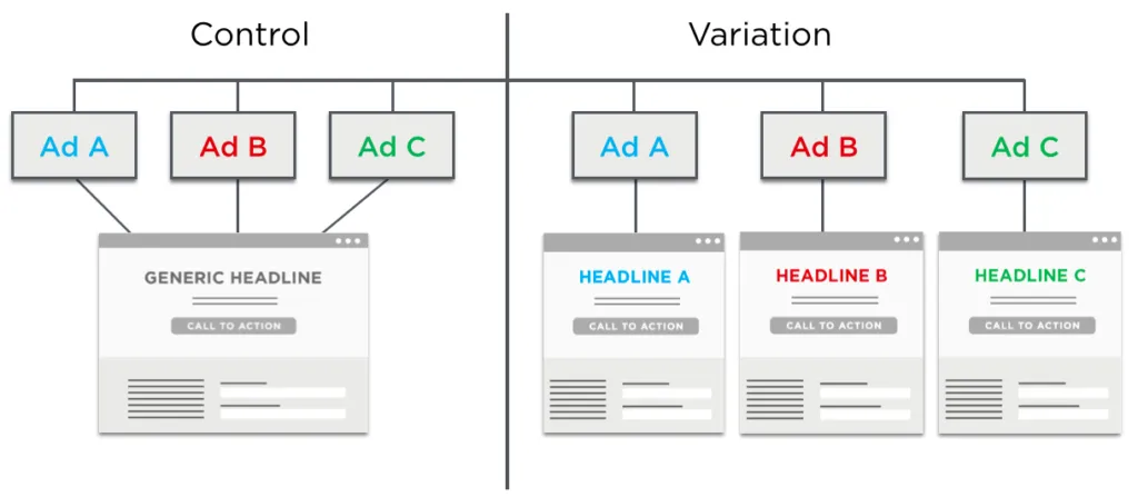
(Source)
WIth this model, you can test different A/B test pages with different ads to find potentially increase conversion rates. Optimizely ran an A/B symmetric messaging study and saw a 39.1% increase in form submission for sales leads. Their conversion rate without symmetric messaging was 12.21%.
How to Use Multivariate Tests
Multivariate tests compare elements inside of a web page instead of a whole new page. The idea is to get a sense of how certain aspects are influencing user action on the site. Examples of test-worthy items are headlines, banner, CTAs, form submission boxes, etc.
The benefit of multivariate testing is being able test multiple elements at once to observe the interplay.
This can make it hard to isolate factors but it does provide results faster than A/B tests. The interaction between elements can be more difficult to pin down but provide a better glimpse into how user behavior is affected by overall changes.
Full-Factorial Design Tests
Full-factorial design tests will remove all the guesswork from the factors and their influences. For example, if you’re testing 4 elements on a page with 3 alternative each, you would test all 81 combinations (3x3x3x3x). However, this methods can require a long time to perform and collect data.
Fractional-Factorial Design Tests
Fractional-factorial design tests only go after a subset of different combinations and their alternatives. These tests run the risk of using small test groups and lending inaccurate results as a result, but if you have adequate sample sizes this can save lots of time in testing.
Many companies slice up behavioral segments and use fractional-factorial tests to gauge how material is interacting with certain visitors. By no means is this method as (generally) accurate as full-factorial tests, but it can provide good signaling for trends.
Checking Results With One- and Two-Tail Tests
The novelty effect is a major factor that can skew test results. Just like red/green button changes, A/B test changes can spike responses and return initially favorable responses that eventually return to an unsatisfying baseline.
Perfect results are impossible to come by. You’re only ever going to be able to approximate and earn a measure of confidence in results.
Why?
Different factors and disparate marketing efforts – like email newsletter, time zones, new and returning visitors and more – mean there’s no such thing as an even distribution within results. Instead, it’s all “clumpy” because the factors keep changing and are largely uncontrollable.
If you’re not careful, this can mean inaccurate test results.
Martin Goodson, author of Why Most A/B Tests are Illusory, reminds us that sample size and time of testing is key. And that improper testing can generate those mythical and misleading results:
“At least 80% of the winning results are completely worthless.”
Smart marketers prefer to use a variety of testing to cross-assess ideas.
One-Tailed Testing
This type of test is a viable option for estimating the extent of changes you’ve made to your site.
One-tail testing is for confirming or disconfirming whether a statistical relationship has changed in one direction from the average (the norm). However, it completely disregards the other direction.
For example, is the average response rate better for this CTA – yes or no? One-tail testing can’t speak to whether it’s worse than average, only if it’s better. These are used to confirm or disconfirm hypotheses made about changes to a site.
Hypothesis: “Changing all headline lettering to type case will improve conversions by 15%.”
Now run a one-tail test. You’ll see whether the averages of results are higher than a previous value or lower than a previous value – but not both at the same time. You could determine a “yes” but you’re blind to a “no.”
This method has a great power to detect an effect in one direction but leaves you without data for the opposite side of the change. Such tests cannot be relied upon to provide accurate statistics but are a great reference to steer additional and support complimentary testing.
Two-Tailed Testing
By comparison, two-tailed testing shows action in the relationship for both directions. You could hypothesize that a CTA would shift your conversions by 10%. This type of test will show whether the average response was higher or lower than the projected 10% shift, providing an idea of new improvements or new shortcomings. The drawback is that two-tailed tests are less sensitive to change.
Standard Deviations
When assessing test results with averages responses across user populations and sample user populations, knowing how to react to your sample and population standard deviation is key.
Standard deviation is also called “standard error” – it’s the number that tells you how far all your testing averages from would fall (over an infinite number of tests) from the current population.
When testing a new CTA, the higher this number is the happier you are. Because it shows that overall the future tests you could run (but don’t have time to) will remain accurate and as successful as your first batch of tests.
In order to show any improvements around changes, measure before and after the changes.
Standard deviation tells us how close results are to the standing average (or expected value) – whether part of your larger group population or whether used in segmented users and test groups.
High standard deviations indicate that the data is spread across a wide range of values. Low standard deviations mean that data is staying close the original average. A high standard deviation is desirable when looking for improvements in CRO efforts.
If you have sample test and want to generalize your findings to your entire population, use the sample standard deviation to draw the most accurate conclusions before sharing them for action.
Statistical Significance
Can you trust your statistics? Why test if you can’t?
This metric for trust is called a “confidence interval.” A 95% confidence interval means that if we repeated all tests, the result would stay the same 95% of the time.
The range of comfort with different confidence intervals is a value judgment. For NASA, their confidence interval is above 99% for launches. For businesses, a confidence interval as low as 51% can prompt a change.
Would you redesign your email template if you were 75% confident in your results? 45%
Most would say yes if it netted them more conversions. After all, you can always change back.
Minimum accepted risk reflects your position in the market, time available, the risks involved, and your trust in new ideas.
Key Takeaways
This article has shown you how to improve the CRO of your web page. It has provided a list of viable CRO updates while also sharing the necessary testing methods to perform your own CRO tests. And test you must.
Because the internet is full of myths that can prove detrimental to your own website efforts. Many CRO changes are valuable and these hinge around consumer psychology and improved UX. But UX varies by demographic.
Only by validating your own improvements can you be sure that your CRO tweaks are increasing conversions. So set up analytics and get a baseline first. Then employ various testing styles to get a clear gauge: A/B, multivariate, one-tail, and two-tail tests can show you the true value of your efforts. And it feels great to know you’ve made a good decision.
Further reading: Jack Kinsella’s CRO Guide