7 Actionable Mobile App Optimization Techniques
“There’s only one true way to win a customer-- treat them like they’re the only one.”
If there’s any mobile app optimization strategy worth talking about, it has to be the one adopted by popular transportation apps like Uber, Lyft, Shyp and Postmates.
Despite having a relatively new and untried servicing model, these transportation apps have scaled rapidly across geographically diverse markets, and onboarded millions of users. Of course, all these apps have a strong product, but that was not the only factor that fueled their growth.
Behind the massive success of these transportation apps are some clever app optimization strategies which have played a major role in building user traction, gaining brand loyalty and improving customer retention.
In this article, I'll share some of the influencing strategies that shaped these startups as powerful global brands.
Optimize Your Onboarding Process
Customer acquisition doesn’t just happen.
Even if you have a great product or a rapidly growing market, you still need to onboard customers and drive them towards their first “Aha!” moment.
However, the challenge to onboarding is that people need “activation energy” to complete any tasks, no matter how complex or simple they are.
It’s best explained by the diagram below:
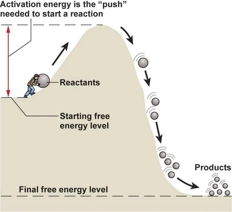
Ever wondered why some people find it so hard to hit gym every morning, but find it easy to dance for hours at a party?
It’s because the activation energy gap is huge in the morning, since you’ve had to push yourself to do something that’s outside your comfort zone. However, if dancing at the party is convenient, easy and provides instant gratification, then it becomes a desirable activity to accomplish.
Therefore, if you want a user to complete a task which they’re least likely to do (like signing up), you should try reducing the activation gap. The lesser the activation gap, the higher the chance that the user will complete it.
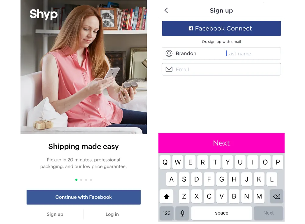
All the popular transportation apps have designed their signup screens with the same philosophy in mind. Shyp allows you to skip the lengthy signup process by allowing you to login through Facebook. Lyft prompts two user fields: name and email on the signup screen, while Uber just needs an email, mobile and password to get you going.
Of course, these apps will need more information from the user to process complex workflows, but the idea is to onboard users with a small amount of data and then prompt for more on an ad-hoc basis.
Optimizing your app onboarding process not only reduces the activation energy gap for users, but also keeps the excitement of getting to that “Aha!” moment alive.
The Secret to Winning is Giving
“Your influence is determined by how you place your customer’s interests first.”
Marketing is all about putting the customer first, and that’s exactly what these transportation apps do.
They tailored their product to suit their customer’s needs and put forward generous marketing campaigns that maximized favourable outcomes for the end-user.
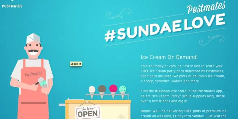
For instance, look at how Postmates offered free pints of premium ice-cream all weekend to attract customers.
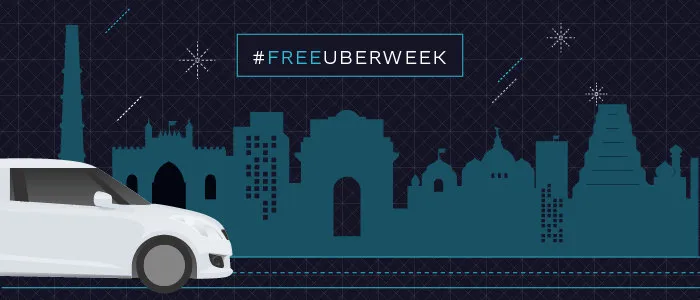
Similarly, Uber ran a #FreeUberWeek campaign, where they gave free first rides.
If you look at these campaigns purely from the perspective of customers acquired, surely these campaigns were highly successful.
But was the Customer Acquisition Cost (CAC) equitable?
If you calculate the total CAC of running such a generous campaign on such a large scale basis, the numbers would turn out to be mind-boggling.
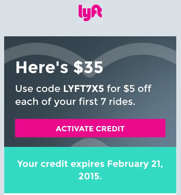
For instance, Lyft gives $35 as activation credit, valid for up to seven rides. Considering the fact that even half a million users used the credit, it’s a marketing expense of $17.5 million. So, the obvious question that pops out is-- was this worth it?
The answer is-- yes.
As per the rule of reciprocity of social psychology, people feel obligated to pay back what they've received. It can be anything from a birthday gift to a great customer service. When people think they get more than they deserve, they have an innate desire to pay back.
Now one may argue about how effective such a system would be outside one’s social circle, but the truth is that it works universally. People adhere to the reciprocity rule, so that they stay consistent with social norms and don’t come out as cheap, inconsistent or ungrateful.
Users might be happy to have received $35 worth of free rides, but when they run out of free rides, they would ride more, thinking that they got heavy discount on the first few rides, and so it’s perfectly okay to pay for rides in the future.
It’s a powerful marketing tactic, since it excites the user at first to try the app, gets them past the activation barrier, and then eventually makes them stay consistent with his choice in order to return the favor.
One Call-to-Action Per Screen
“A user interface is like a joke. If you have to explain it, it’s probably not that good.”
Users crave simplicity. They want workflows that are simple to understand and actions that can be completed without much thought. It’s almost like the interface should guide the user on what to do next, because most of the time, the user would be lost on how to proceed.
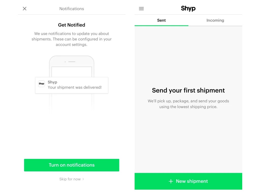
Perhaps the best example of this is the Shyp home screen. The green button at the bottom is placed at a very convenient location, and literally screams for attention. In case you want to give users a choice between two options, you can put the less desirable option in a lighter shade, and the favorable option in a brighter shade. It simplifies the decision making and clarifies the app’s unique value proposition.
Having an unique ‘call-to-action’ per screen is powerful because when users are presented with a limited number of choices, they decide more quickly. It’s a classic example of paradox of choice, which reinforces the concept that 'with increased options comes increased indecision'.
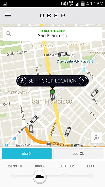
For instance, look how Uber removes the ambiguity for booking a new ride. You simply have to drag the pin and set a pick-up location, and it does the rest for you. It’s a powerful app optimization that not only improves conversions, but also delivers an amazing customer experience.
Of course, there are other call-to-actions required, like, setting the destination, picking the payment option and choosing the type of ride, but the interface simplifies the task by allowing the user to focus on just one action at a time.
Get Data When You Need It
App optimization is not just about reducing friction for the user.
It’s also about putting these choices in the right context, so that they appear relevant, responsive and reasonable to the user.
For instance, when a user signs up on the Postmates app, the intent of the user is to find out what the app has to offer. Therefore, it optimizes the onboarding process by asking for less information.
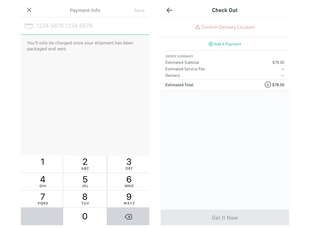
The app then allows the user to freely browse and add products to the cart. Only when the user clicks on “Check Out”, the app prompts for delivery location, payment details and more.
The idea, here, is that users would be more willing to complete activities when they’re captured in the right moment.
From the user’s point of view, it makes sense to add payment details and shipping information, since they’re checking out. If the same information had been asked while signing up or before they started shopping, they would have not been motivated enough to fill it.
The same design philosophy can be applied to improve user-responsiveness as well. For example, asking users to rate the app after they’ve had their first “Aha!” moment is a much better strategy than asking the users to rate the app randomly.
Be realistic. No one likes surprises.
Customers love honesty. They trust brands that cater the best possible services, with minimum degree of surprise. The ugly truth, however, is that it does not always happen.
In an idealistic world, your services would run perfectly and nothing would go wrong, but when you’re catering services to more than a million users in the real world, there are bound to be some operational lapses. You may suddenly have more riders than drivers, or you may have more orders in the system than you can handle.
While it’s not a great marketing tactic to disappoint the customer, or charge them more for the service, sometimes you have to make difficult choices to keep the ecosystem sustainable. There are better ways to handle such challenges than pretending they do not exist.
For example, Postmates informs the user, well in advance, that the store might run out of their ordered item, and they they should consider planning for it. It allows the user to swap their choice with a popular item, leave it out, or just cancel the entire order.
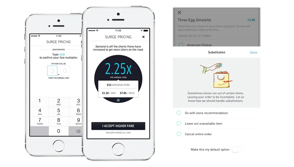
Uber keeps the rider-driver ratio balanced by increasing the surge pricing, so that there are more drivers on the road to cater to the rising demand. Instead of letting the customer know the price-change after the ride, Uber informs them well in advance, and prompts them to confirm the price.
The idea is to reduce the element of surprise, invoke transparency and ensure that your customers are comfortable with the alternate proposition. What’s also noteworthy is that these apps give users a choice to accept the change or cancel the order, so that users feel responsible for their decision, and have no reason to blame the system. [Read: Coercion can make people feel less responsible for their actions]
Justify Your Pricing.
Price justification is important, especially when you’re charging users for something that they may not see the value in. A good example of this could be shipping costs or packaging charges.
As this survey points out, 55% of shoppers abandon items in the cart, because of the shipping costs or packaging charges.
Now, an E-Commerce store or delivery service may argue that these charges are necessary, because in reality, there’s nothing like “free shipping”. It’s an attempt at making the whole system transparent, sustainable and honest, so why is it not working?
It’s because users don’t find the charges reasonable enough.
If you can justify the levied charges with a “Learn More” or “Why am I being charged?” link, there are chances that users might as well pay for it.
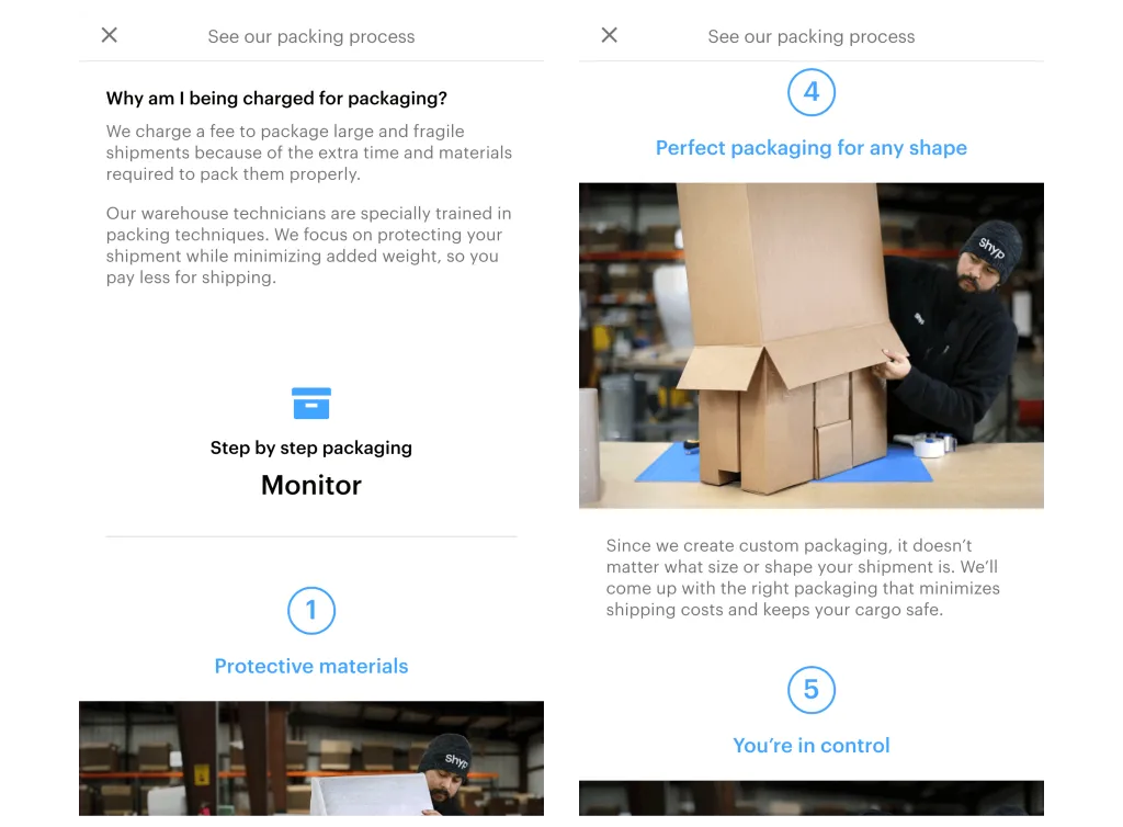
For instance, look at how Shyp justifies its charges for packaging content. The app gives a short preview of the entire packaging process, and acquaints the users with the potential benefits of it, like: improved tracking, more protection, perfect packaging, etc. In other words, it takes the focus away from the price taken to the value being delivered.
Now, that’s a very powerful marketing strategy, because it now makes the pricing sound completely reasonable. It also reassures the customer about the quality of services being delivered, and brings them closer to your brand.
A complete win-win.
Referrals are Powerful.
“The best compliment from a customer is a referral.”
Referrals are powerful for a variety of reasons.
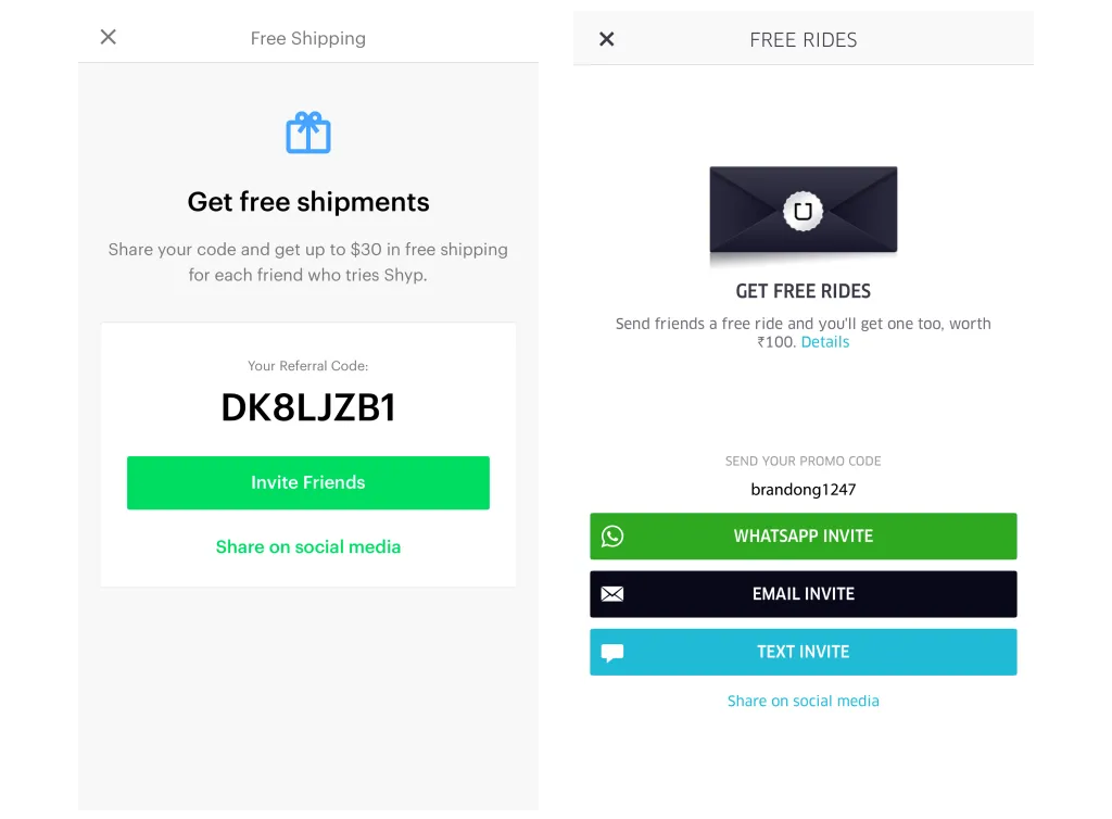
First, they provide a solid incentive for a user to onboard the app. For instance, Uber offers free rides when you refer a new user, and also offers a similar incentive to the new user.
The referral codes that these apps offer are easy to share, right from the app. In fact, Uber goes a step forward by highlighting the three popular mediums of sharing your referral code. Again, the idea is to maximize the impact and minimize the activation energy.
Secondly, these referral codes provide solid organic growth. They motivate people to share the app in their personal circle, thereby making them promote your app. The social proof principle then comes into play, when people start assuming everyone’s action as correct.
Thirdly, once the new behaviour is established, people will stick to it, even when there’s no added incentive. That’s because people are wired towards staying consistent with their beliefs, especially when they’ve referred it to other people. If you’re skeptical about this rule, pause and think about all the things that you’ve referred to other people. Aren’t you using them, too?
Summing it up …
It’s fascinating how these transportation apps use the principles of social psychology, minimalist design and referral marketing to gain unprecedented levels of traction in the market.
It goes on to show that just having a good product is not enough. You need to start giving more in value than you take in payment, and you need to start serving more people, and serve them well.