Improve Your Mobile Optimization Strategy With These 7 Steps
Mobile optimization strategies have helped music streaming apps like Pandora, Apple Music and Tidal completely disrupt the music industry. With their cost-effective pricing, large collection and ‘on-the-go’ experience, they've managed to convince even the long-standing music pirates that streaming is the way to go.
But how did they do it? How did they manage to onboard millions of users, convert them to paying customers, and clock billion dollars in revenue?
Behind the massive success of these music streaming apps are some clever mobile optimization strategies that have played a pivotal role in their success. These strategies were key to improving every growth metric that matters-- acquiring new users, optimizing app experiences, building user engagement, retaining customers or increasing revenue.
Here are the seven mobile marketing strategies that stole the show:
Onboard Users With Visual Tours.
“If you can’t explain it simply, you don’t understand it enough.” - Albert Einstein
In my previous post, I explained how customer acquisition doesn’t just happen, and how there’s an activation energy gap associated with getting users to a “must-have” experience.
But what happens after you have successfully onboarded an user? How do you ensure that the “must-have” experience is delightful? How do you decrease your churn rate and significantly improve conversion rates?
The answer is simple-- by delivering a solid first run experience.
You need to crunch all the key features of your app into a short and compelling onboarding experience, so that newly onboarded users can comfortably navigate across screens and understand your overall app experience.
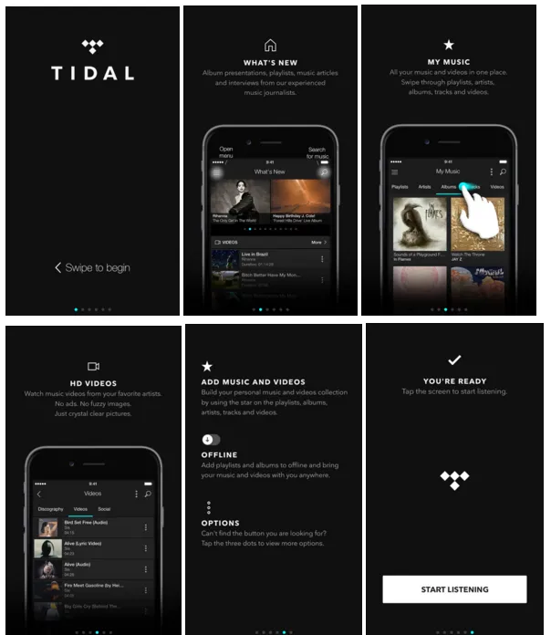
For instance, look how Tidal improvises its onboarding experience by giving users a preview of all the features available on the app. In just four screens, it explains the whole app experience, and succeeds in getting a newly acquired user excited about the product.
The timing is crucial, because it’s only at the start that the user interest is at its peak and they are genuinely interested in knowing your value propositions. It also makes the first “must have” experience predictable and smooth, as users know where to find what they need.
The next important aspect is the flow of information.
As a general rule of thumb, you need to start with the basic functionalities that are central to your app (most popular features) and gradually move towards advanced features (highly specialized features). For instance, Tidal navigates user from previewing the music library towards advanced features like offline storage and personalized music.
Lastly, you need to keep your visual tour short, direct and simple. Users have the attention span of a gnat, and they’re likely to skip anything that’s verbose, lengthy or too complicated to comprehend.
Don’t make your visual tour too overwhelming for the user.
Your app might have hundreds of features, but you just need to pick up the best ones that deliver the maximum value, and put them upfront. It’s okay to let the rest of your app be a surprise package for your users to discover on their own.
Free Trials for the Win.
Free trials are everywhere, and they’re a powerful marketing tactic. They dramatically reduce the initial friction [read: activation gap] and provide enough incentive for new users to try the app [read:“risk-free” experiences].
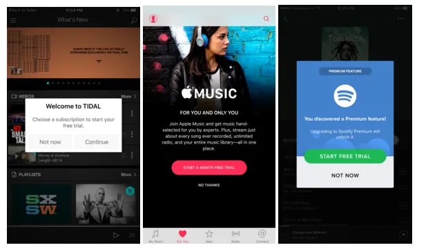
Most music streaming apps, like, Tidal, Apple Music and Spotify already recognize this. That’s the reason they offer free trials, so that they can onboard users and get them to a “must-have” experience.
The idea, here, is that if the app succeeds in delivering a great experience to the user, the user would be able to see the value delivered by the app, and won’t mind paying for it. The reciprocity principle states that humans are wired towards repaying whatever they receive from others.
While the rule is universally applicable, there’s a small yet important catch to it. It only works when you deliver a ‘valuable experience’.
For instance, if Netflix decides to offer free subscription for a month, but limits the content availability to an extent that you can’t find any of your favorite shows, you won’t feel obligated to payback. Worse, you might even decide to discontinue the service, since you failed to have a great experience.
So, while offering free trials, it’s absolutely important to understand that users feel obligated to repay only when they feel they have received more than they have could possibly asked. That’s the reason these streaming apps offer “premium” features in their limited period trial.
These premium features not only succeed in delivering a great user experience, but also get users hooked by putting them in the habit loop (cue-routine-reward).
There’s a reason these apps offer one month (Tidal, Spotify) or three months free subscription (Apple Music). It provides sufficient time for transforming user behaviors into routines, and ensuring that they see value in the offering (reward), but not enough to make users lose interest or take the whole experience for granted.
Move Beyond Customization. Personalize User Experiences.
“If your target audience is not listening, it’s not their fault; it’s yours”- Seth Godin
Users don’t know what they want unless you show them what you have to offer. And they won’t take what you offer, unless you deliver a experience that matters to “them”.
Now, the reason why I emphasize on “them” is because software products might have a significant advantage in economies of scale, but to succeed, they still need to personalize content and deliver experiences that truly matter to their audience.
For instance, imagine what would have happened if Facebook’s news feed pulled up all the stories in your inner circles, without trying to understand your personal preferences. Or what would have happened if Google pulled up generic search results for every query, instead of optimizing results based on your history, location or preferences.
They would managed to scale experiences, but they would have failed to deliver value.
That’s exactly the kind of mobile optimization philosophy these music streaming apps are applying, too.
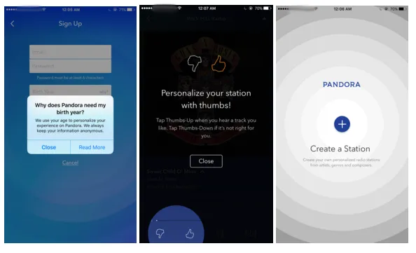
For instance, Pandora asks for birth year, gender and location when a user signs up, so that it can use the personal information for better song recommendations. It also takes active feedback from user, with the thumbs up or thumbs down buttons, so that it can optimize song suggestions. It even lets users create their own station, based on what genre they like, thereby reducing the overflow of unwanted content.
When you understand what the user wants and you optimize the experience by sharing contextual information, you dramatically improve your conversion rates and customer lifetime value (CLV). No wonder why Pandora succeeded in getting more than 3 million paying customers.
Now, the biggest challenge to personalizing experiences is getting the required data points. Notice how Pandora asks the personal information while signing up? It’s because users won’t feel motivated to share that information later.
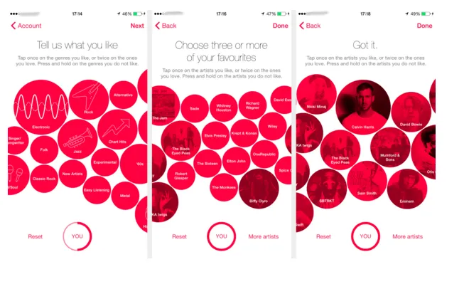
Apple Music improvises by using an aesthetically pleasing layout for capturing personal information, so that users are tempted to pick choices that suit them the best and leave out the ones that they don’t like (tap once to like, twice to love, and hold to remove).
The whole idea behind these screens is to motivate users to share personal information, without making it a painful exercise that they would most likely skip.
Content Curation is where all the magic happens.
While user interface does matter, content is the heart and soul of your app. Especially since the most popular website in the world is a webpage with an image and a textbox.
Sure, how you deliver content matters, but “what” you deliver matters even more.
Most of the time users are looking for ideas, trends or themes, and their needs are not specialized. Perhaps, that’s the reason why there are more generic searches on Google than specific searches.
Therefore, it’s important to curate content.
Now, curating content is different from creating content in the sense that when you curate, you aggregate similar content and package it in a theme that would be interesting to the user. It’s an incredibly powerful tactic that allows you to reuse information and enhance content discovery.
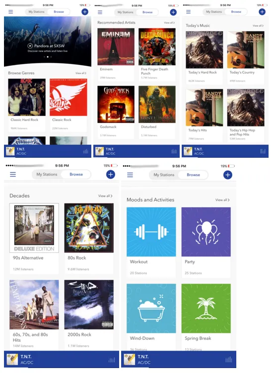
For instance, look how Pandora curates content by creating customized playlists that cater to a specific theme. You can pick a playlist based on your favorite artists, listen to what’s trending right now, or you can just choose a playlist that best suits your activity/mood (Workout, Party, Spring Break, etc.).
Content curation addresses the fact that users are looking for contextual information, and that they’re more likely to choose handpicked lists than take the pain of manually compiling them. It also implies that users are more likely to engage with the content, when it’s presented in a relevant context.
For instance, users are more likely to listen to rock songs when they’re compiled in a playlist, but hardly anyone’s going to take the pain of searching those tracks individually (Context>Content).
By reducing the friction between user inquisition and content discovery, content curation succeeds in keeping users engaged and makes them come back for more, thereby improving customer retention. In rather simple words, it makes the magic happen.
Improve Conversions with Quid Pro Quo
The problem with offering your service for free is that users take it for granted. The problem with making users pay for your service is that you risk capturing a relatively narrow segment of the market.
That’s the reason why some music streaming apps like Pandora have adopted a Freemium model. If you don’t want to pay for using Pandora, you can still enjoy the service by opting for the free plan, and tolerating the ads.

Now, Pandora realizes the fact that users absolutely hate ads, and that they’re most likely to close the banner or not interact with it at all. So, they optimize the opportunity by offering small rewards for interacting with the ads.
For instance, Pandora offers an hour of uninterrupted, “ad-free” listening for watching the advertised video, or interacting with the ad. Since users have nothing to lose, they take the bait and watch the video. The result? Pandora succeeds in boosting CTRs, impressions, and overall engagement rates of the ad campaign, thereby directly increasing its advertising revenue.
The quid-pro-quo strategy is brilliant, because it not only helps Pandora monetize from its 84% Freemium user base, but it also helps in improving its user experience. Users love the fact that they got a really sweet deal (15 seconds of interaction v/s 1 hour of uninterrupted music), at no extra cost.
It also gives them a feel of the “premium” experience, thereby increasing the chances of converting them into a paying customer. A perfect win-win.
Create irresistible, ‘hard-to-miss’ CTAs.
“The main thing is to keep the main the main thing.”- Stephen. R. Covey
That pretty much sums up everything there’s to know about call-to-actions (CTAs). Your CTAs are the key element of your app-- the gateway to that “must-have” experience. And it’s important to make the users feel that they’re an integral part of your app experience.
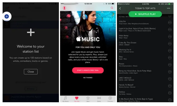
For instance, look at Pandora’s CTA. The small “+” symbol allows users to instantly create their own radio channel and stream their favorite music. Apple’s “Start 3 Month Free Trial” CTA is tempting, because it offers a great reward and highlights the benefits of onboarding. Spotify’s “Shuffle Play” is also a tempting CTA, since it’s impossible to miss, and is always visible, even while the user scrolls down.
If I had to break-down the key characteristics of good,“irresistible” CTA, it would be:
- Visibility: Your CTA button should be strategically positioned, so that it’s almost impossible to miss. It would also help if you fixate its location on the overall app experience, so that users know where to find it. It also helps to use a high-contrast colour, which makes the button stand out from the background.
- Language: You should always look to keep the tone direct and actionable. Avoid ambiguity at all costs.
- Reward: Your CTA should deliver instant gratification to the user. If a CTA has no reward associated with it, the user would never feel tempted to click it.
Virality is an imitation game.
Spotify uses the power of network effect to deliver a powerful experience. Network effect is a phenomenon, where a product/service becomes more valuable when more people to use it. A good example of it is a telephone network.

Spotify capitalized on the network effect by integrating with social media channels like Facebook and allowing users to share their curated playlists. It allowed brands/music artists to connect with fans, and allowed them to promote their content to a relevant audience.
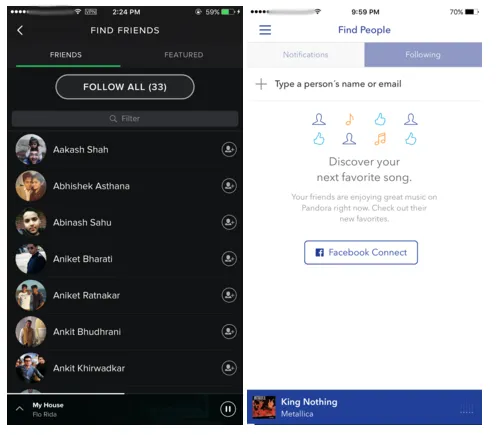
Users loved the fact that they could connect with their favorite music artists, and look up what people in their inner circles were listening. It paved way for a whole new way of content discovery, which only got better as more and more users moved to the platform.
When users saw that millions of people are now listening to Spotify, they validated the clearly evident social proof, and Spotify’s virality curve kept getting more vertical with time.
Of course, apart from social media, Spotify got a lot of ‘word-to-mouth’ publicity because of the free trials, cost-effective pricing, and easy accessibility to a large collection of songs/playlists.
But if I had to explain this phenomenon in rather simple words, I would say that virality is an imitation game. When people can’t make out whether they need to try something, they assume other’s people's actions to be correct, and adapt quickly. And, if you can deliver an experience that’s worth bragging about, your growth graph, like Spotify, would always be parabolic.
Wrapping it Up...
So often, we take growth of a startup/app for granted.
But, behind every popular product, are clever strategies that paved way for its phenomenal success. Whether it’s the viral network effects, effective conversion tactics or personalized content curation techniques, every growth hacking strategy plays a pivotal role in taking the experience towards that sweet spot, we call product-market fit.