Examples of Cloud Storage Referral Programs
We all know about the success of the Dropbox referral program. This is one of the first industries to adopt referral programs and there are some new players in the market that are gaining ground quickly in the race for enterprise cloud storage dominance.
We’re going to break down the customer referral programs of newer entrants Copy and SpiderOak. They clearly see the value of adopting this acquisition strategy so they can compete with the bigger companies in the space at a lower CPA.
Copy
Incubated by and built on the same cloud as Barracuda. (NYSE: CUDA) Copy is rooted in both security and storage technologies, making Copy for Companies a great option for businesses that want to layer control over sharing services employees use.

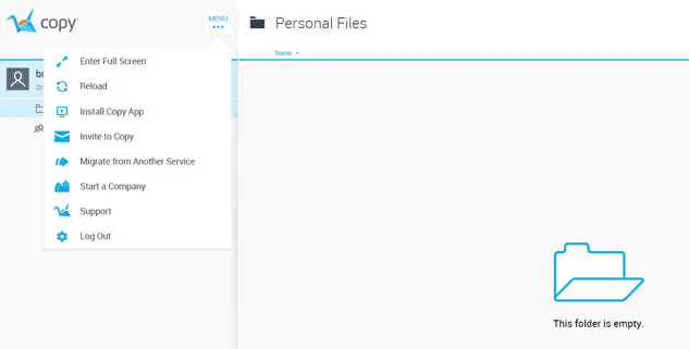
Program Placement
Copy does a great job with their program placement within the user experience. They placed the Referral Program Invite button directly in the main navigation bar.
This is an awesome way to increase a referral programs’ visibility. We highly recommend bringing your program front and center so your referral program become a profitable acquisition channel.
Additionally I would recommend finding happy moments where you can ask a user to make a referral. In this case you could ask for a referral after your program finishes a big file upload.
The idea being that there are ideal moments in the user experience where the user is getting the largest value out of the product and is much more likely to make a referral.
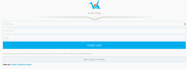
Program Homepage
While I do believe in creating simple and low friction referral programs, this one needs some work. This is an example of a company going too far when they are try to reduce friction and end up ripping out too much.
You don’t want to leave the user confused and frustrated by not explaining the program clearly. I would recommend increasing the visibility and messaging of the offer to make a referral.
In this case, moving the 5 GB offer ahead of the contact form as well as increasing the font size and weight will help communicate the value the user is getting by making a referral.
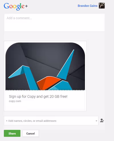
Sending the Invite
Though I do like the use of visual content in the referral invite as this is a growing optimization trend for social sharing. Unfortunately, their G+ referral invite isn’t auto-filling text to make it easier for the user to make a referral. This is an important area to address when you are looking to increase the performance of your referral program.
Just like reducing the number of pages it takes to make a referral, you should look to reduce the amount of text a user needs to write to make an invite/share.
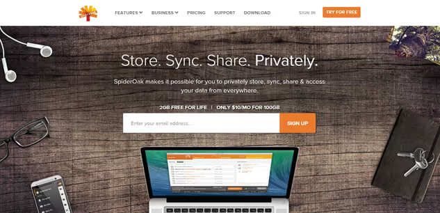
SpiderOak
SpiderOak is an online tool allowing users to back up, share, sync, access and store data using an off-site server. They use a “Zero knowledge” framework that keeps your data 100% private and only readable to you. A competitor to Dropbox that recently got privacy advocate Edward Snowdens’ approval.
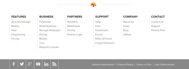
Program Placement
Unfortunately SpiderOak doesn’t put their referral program anywhere inside the product. They hang it out to dry in the footer of the main website. This is a common problem with referral program implementations.
Since they are similar in structure to affiliate programs, companies look to place them in a similar spot. Unfortunately, they don’t realize the best place to ask your user for a referral is within the product itself.
It’s likely that the referral program took longer than expected to develop and left no time for product implementation. So they decided to cut their losses and stick the referral program on the website instead of within the user experience.
I would highly recommend they dedicate additional development time to properly integrate the referral program within their product.
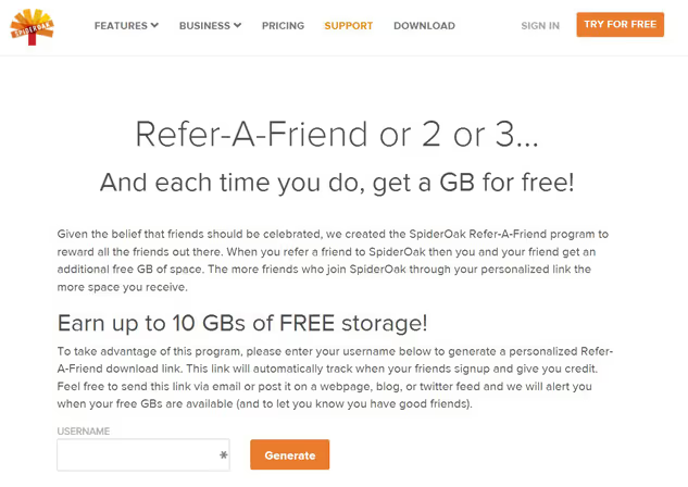
Program Homepage
While I don’t agree with placing the program outside of the product, I do like how they clearly communicate the value of making a referral to the user. If they’re looking to improve this page I would cut down on the text and move the CTA closer to the top.
I’m also a big fan of the size of the reward they are offering to the user to make a referral. This is a huge factor in the success of a referral program.
Understand the underlying motivation of your users to make a referral and then design the program to reward that behavior.
What do their users want? More storage!
So give them a way to earn it and you’ll create a win-win situation.
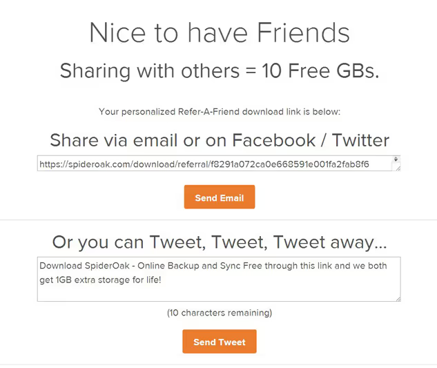
Share with Friends
This is a well-designed referral invite page. It has clear and concise messaging that reminds the user why they are making a referral and suggests two ways they can make an invite.
Still, I do think there is room for improvement. One area they should look at is reducing the size of the link in the first call to action. IE (spdr.oak/32c45)
TL;DR
No referral program is ever perfect. Just like there is no such thing as a perfect landing page or email campaign. Even if a program is delivering results, there are always places that you can improve.
Whether it’s auto-filling the invite text, targeting happy moments or increasing its visibility. The truth is you can always find a way to increase the performance of your referral program.