7 Premier Bank Referral Marketing Campaigns
Bank referral marketing campaigns are widely adopted because they bring in long-term customers and reward loyal customers. Engaging and retaining existing clients while converting new customers? Worth the investment.
This rings doubly true because Harvard Business Review reports that referred clients will generate 15% more profits than non-referred clients. And these customers are 15% more likely to stay loyal to the bank.
Figures such as these are lifelines. According to research by the World Review of Business Research (WRBR), the banking sector industry is combating serious downturns in customer satisfaction.
While shifting to accommodate mobile customer demands, banks simultaneously need to continue delivering a rewarding customer experience. Because customers nowadays are distrustful of the impersonal nature of finance, referral campaigns are cashing more checks than ever. Like a small-town bank where everyone knows your name, word of mouth marketing is humanizing banking in a big way.
However, don’t take my word for it. Let’s see 7 great examples of banks using optimized referral marketing to help consumers deposit both earnings and trust in their financial institution. We’ll look at specific channel strategies such as websites, landing pages, email and FAQ sections to make sure we get the full picture.
#1 CitiBank - Referral Landing Page
(Source)
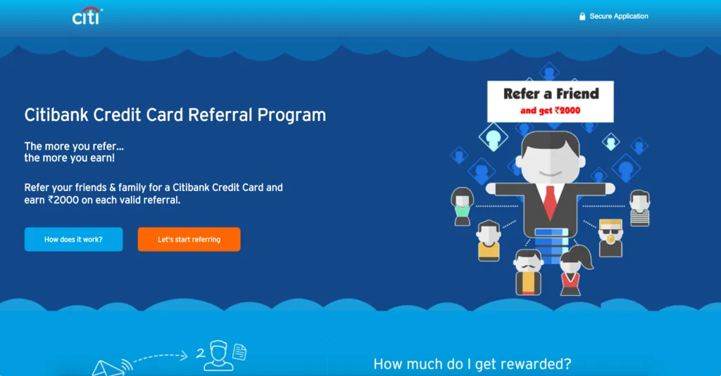
CitiBank uses internationally applicable principles of social proof to encourage customers to refer associates for credit cards. Friendly cartoon avatars lend this landing page a youthful, social feel while effectively illustrating the availability of free cash. The blue on blue color palette keeps the mood tranquil and relaxed while ensuring the orange energy of CTA button stands out in sharp relief.
The language of “Let’s start referring” coaxes visitors to think of referrals as they truly are: a chance to connect within their network. Copy here is simple and structured to match the design. CitiBank wants visitors to jump right to conversions, so the 4-line parallel structure at left speeds us along to the values that await.
When it comes to matters of layout and design, less is always more. This landing page is a great example of how childishly straightforward you can make a conversion process. And how simplistic driving engagement can be with a referral program.
#2 CitiBank - Referral Program FAQ Page
(Source)
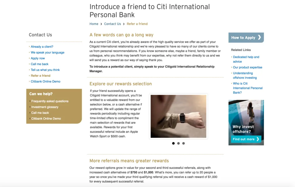
A crisp layout accented with gold highlights gives this CitiBank referral page serious weight. However, the words, many though they may be, hold the real power. The brand does well to frame this page as a conversation shared within an inner circle, thereby granting it an air of exclusivity and prestige.
The copy is both precise and grandiose, warming readers to how easy it is to “introduce a potential client” to “your CitiGold International Relationship Manager.” Yet, only if our referrals are deemed “successful” can we earn ourselves a fancy Apple Sport Watch (pictured) or $500 smackeroos.
Cheers to CitiBank for flipping referral tactics on their head and guarding the gates with some good old-fashioned reverse psychology. By depriving customers the security of a guaranteed reward, the bank increases engagement while retaining customers and their interested attention.
#3 Western Financial Credit Union - Referral Landing Page
(Source)
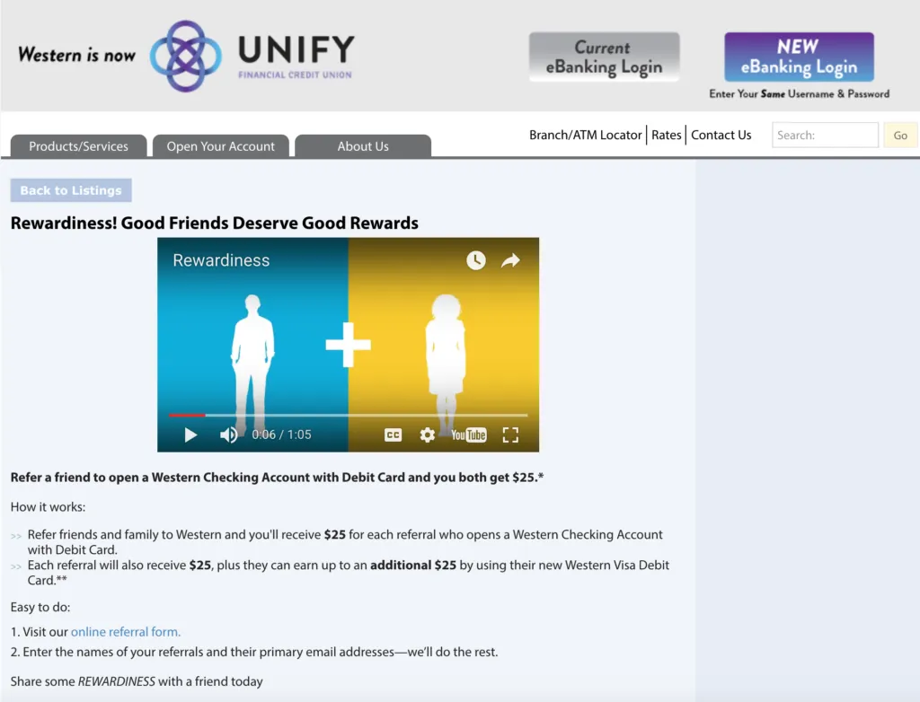
Western’s video landing page is a perfect example of how to simultaneously drive engagement and reshape image. The YouTube screen shimmers bright yellow to inspire enthusiasm and the bold blue relates feelings of brand loyalty. Viewers are treated to a lighthearted yet informative journey which clearly shows both avatars loving the new Unify experience.
Stimulating visual aids and persuasive copy will remain permanent fixtures in any convincing brand message. This transitional company knows that to retain clients and convert new customers requires a deft personal touch and a voice never before seen their industry. “
“Rewardiness” is a perfectly fun way to describe a referral program. It’s both informal and enticing to customers already willing to bring friends along for the benefits.
The playful slogan “Good Friends Deserve Good Rewards” is clarified by two different bullet lists below. Supporting copy makes smart use of bold, outstanding font and spells out exactly how incoming viewers can achieve the $25 value by partnering up with Unify.
#4 HSBC - Referral Landing Page
(Source)
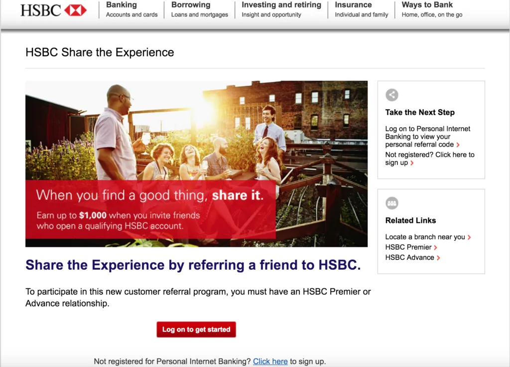
Clean and direct, the HSBC website emphasizes the importance of having a rewarding relationship with your bank. As the desirable photo shows, enjoying great times with besties is about being a good friend first. Banking upon the psychological pull of exclusivity here, HSBC invites us to “Share the Experience,” but first we must invest a bit more with them. The bank boldly highlights the $1,000 valuation and enviable good times to be had by moving forward with them.
Banking on the psychological pull of exclusivity, HSBC invites us to “Share the Experience,” but first we must invest a bit more with them. The bank boldly highlights the $1,000 valuation and enviable good times to be had by moving forward with them.
Banking upon the psychological pull of exclusivity here, HSBC invites us to “Share the Experience,” but first we must invest a bit more with them. The bank boldly highlights the $1,000 valuation and enviable good times to be had by moving forward with them.
Unmistakably clear in honest white, the value proposition coordinates with a vivid red copy box to communicate action and enthusiasm. Tying in brand image with color theory proves effective here: Seize the day before a good thing’s gone!
The boxy design layout helps move readers’ eyes and actions around the page, creating a consistent format and helping us read each bit of text. Spiraling outward, the visual hierarchy first centers on action first but then provides necessary information on the periphery for those who can’t convert immediately.
#5 GTE Bank - Referral Landing Page
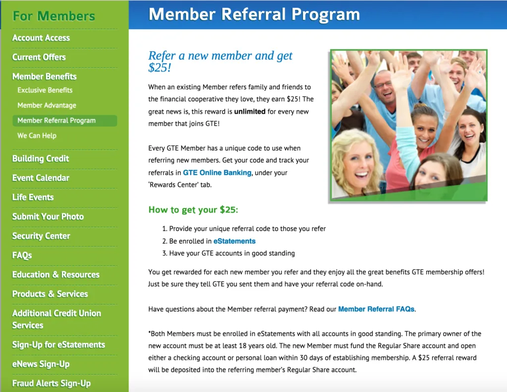
Accessible via the “Member Benefits” section, GTE Bank suggests to customers the added benefits of making referrals. Our first impression of this page is smiling faces, framed in a trustworthy shade of blue and vibrant, enthusiastic green. GTE Bank adds more excitement to the referral process by punctuating their headline and sentences with repeated exclamation points. Engaging customers is as much about making an appropriate recommendation as it is about sharing value.
GTE Bank adds more excitement to the referral process by punctuating their headline and sentences with repeated exclamation points. Engaging customers is as much about making an appropriate recommendation as it is about sharing value.
That said, bright reminders of the “unlimited” dollars available to us are sprinkled across the screen. By highlighting and bolding certain phrases in color, the bank helps move the reader through the informational copy and into the good stuff: “How to get your $25.” Giving a list simplifies steps while the action verbs “Provide, “Be enrolled” and “Have” remind us of the socially rewarding aspect to
Giving a list simplifies steps while the action verbs “Provide, “Be enrolled” and “Have” remind us of the socially rewarding aspect to making referrals.
To retain happy clients and maximize potential conversions, instructive and actionable language is a must. GTE Bank shows us that when dealing with money, clear and concise copy wins every time.
#6 Capital One - Refer a Friend Landing Page
(Source)
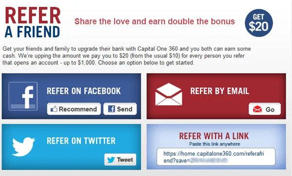
Capital One banks upon widely recognized social share call to action buttons to carry them to increased conversions. The brand succeeds by using an all-American color arrangement atop an easy-to-use block layout.
With a simple design, customers hardly need read the copy to understand that the “Refer a Friend” campaign is going to make them and their pals some easy cash. A simple glance to top-left, top-right and finally landing upon the four, perfectly consistent “Refer” CTA links reveals each essential piece of the referral process.
(Source)
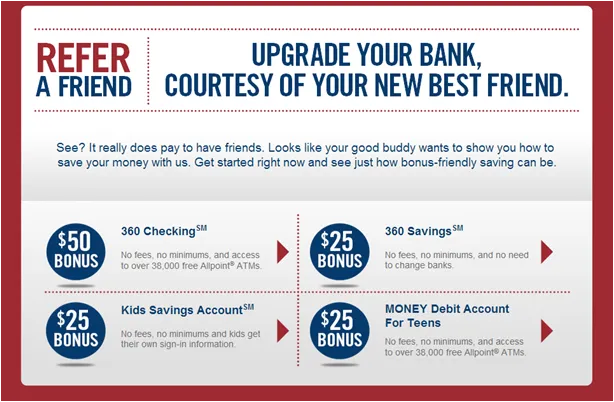
This referral call to action is taken from a separate page that Capital One uses to promote their new online banking app. Highlighting the importance of a mobile optimized referral program, this bank is following the trend towards handheld convenience and shares between friends.
We see that the design remains consistent, which is great for keeping viewers on the same page across all channels. Promoting action such as “Upgrade” and reinforcing the convenience of “courtesy,” Capital One positions itself as our trusty “New Best Friend” who’ll help us make the switch to online banking.
Our new 'best friend' encourages us to widen our circle of friends, using navy blue emblems to signal both feelings of assurance and the great benefits that await once we make the invites.
The hallmark of an optimized referral campaign is segmenting user engagement across different account signups, giving Capital One additional insights into the best practices for retaining and converting these customers in the future.
#7 Capital One - Refer a Friend Email
(Source)
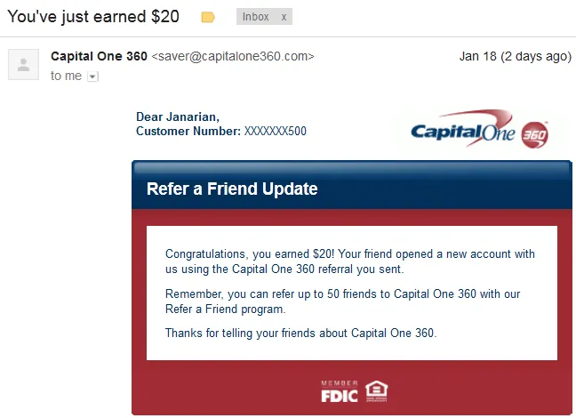
Again, Capital One wastes no time delivering immediate value with this follow-up email for referring customers. Optimized referral marketing campaigns hinge upon perfectly tight email subject lines such as the one above.
As the first impression, readers are drawn in by self-referential copy that communicates explicit value and “just” happened newness. The body copy starts with a friendly acknowledgement of the referral success then gives us the scoop on how our friend is doing (always appreciated).
This “update” is an effective way to encourage more referrals and drive more conversions using the best customers. Employing psychological tactics like positive reinforcement and self-affirmation theory prompt further action in the receiver. As if the clearly stated $20 earning wasn’t enough value, the email copy is populated by lots of numbers - which keeps readers focused on future earnings.
Your Statement Notes
This has been a 7-part list showcasing great examples of banks effectively using referral marketing strategies. We see a common theme: banks emphasizing ease and emotive excitement around connecting with friends.
Personal finance can be a bit lonely. Giving consumers a chance to infuse their everyday transactions with a bit of life goes a long way in creating a rewarding customer experience. Looking towards engagement and conversions, strong copy with an appealing design and compelling rewards will always seal the deal.